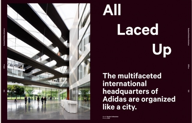
The multifaceted international headquarters of Adidas are organized like a city
It’s a big undertaking: coming up with a concept for the international headquarters of a world-famous sports brand that outfits individual athletes, including NBA star Dwight Howard, as well as entire football teams. Luckily, Aachen-based Kadawittfeldarchitektur was up for the challenge. Located in the southern German town of Herzogenaurach, about 30 km from Nuremberg, the new Adidas research-and-development centre matches the brand’s dynamism. The long, angular building shouts ‘energetic’ and ‘athletic’; its sleek, subtly sloping façade sports horizontal bands that make the volume appear to be floating above the company’s World of Sports campus. With a total floor area equal to the size of about eight football fields, the complex houses the company’s creative divisions, staffed by some 1700 employees whose new workplace contains a bistro, a test hall, a biomechanical lab, sample workshops, material labs and conference rooms. ‘We didn’t set out to build a metaphor,’ says Dirk Zweering of Kadawittfeldarchitektur. ‘It’s the automatic result of our concept.’ Instead of focusing on architecture that would reflect the organization’s corporate identity, the designers concentrated on producing an environment that would appeal to Adidas’s predominantly young, international employees, while providing them with a platform for creativity.
Inside the building, the first surprise of Kadawittfeldarchitektur’s competition-winning design is a circular atrium that narrows at the centre before widening as it stretches through four levels, finally reaching the airy membrane roof. The highlight of this vast, light-filled space is a series of suspended walkways that crisscross the void, interconnecting offices. Reminiscent of a laced-up sneaker, the spatial network gives the building its name, Adidas Laces, while capturing the corporate identity of a brand – founded by Adi Dassler – that became famous when West Germany’s football team, wearing Adidas shoes, won the 1954 World Cup. The network of walkways in the atrium also represents the multi-layered communication structure of the Adidas community, made up of material researchers, designers, product developers and engineers. Surrounding the atrium, clusters of offices wrapped in floor-to-ceiling glazed walls face the core of the building. The architects seem to have regarded each office cluster as an apartment block and each suspended walkway as an ordinary footpath. ‘Our architecture does represent urban space,’ says Zweering. All movement between departments takes place on the walkways, which together form a kind of urban square that leaves the office floors undisturbed by through traffic. Office modules on the upper levels line a central corridor, allowing workstations to be orientated towards the atrium and the surrounding landscape. A complex technical network hidden in the ceiling enables a highly flexible organization of office space, which can be configured and reconfigured to meet specific work requirements. Free of partitions, the open-plan floors feature a modular furnishing system developed by Kinzo, a Berlin-based design studio. In contrast to the palette of light tones used in the offices, the colour scheme in the lounge areas-cum-communication centres includes anthracite-grey floors and ceilings, which are distinctly visible from the walkways. Kitchens in bright primary and secondary colours serve as additional orientation points, complementing the comprehensive signage and visual-communication system designed by Büro Uebele of Stuttgart.
Occupying an area at the rear of the atrium is Adidas’s green, landscaped ‘Innovation Valley’. Home to research facilities and labs, the space also boasts an impressive ‘Athlete Services’ area that caters for teams, contract athletes and VIPs. Custom designed by Kadawittfeldarchitektur, a luxurious U-shaped display unit clad in black leather can be used to present new products. Black is also the colour of the graphics on curved glass panels that separate adjacent spaces for individual consultations, where oversized dot-matrix renderings, designed by Büro Uebele, form a graphic wall of athletes’ images that doubles as a privacy screen. Curtains inside the consultation space can be drawn to provide occupants with a totally secluded cubicle. The new building is proof that even with input from various sources, a project this size can obtain a harmonious result. ‘Custom-designed furniture engages with both the architecture and the visual-communication system, all of which has been adapted to the particular space in question,’ says Zweering. ‘Together with our clients, with Kinzo and with Büro Uebele, we achieved an integrated solution – which is very rare, indeed.’
Furniture: Change It Up
From the outset, Kinzo worked closely with both Kadawittfeldarchitektur and Adidas to develop customized office-furniture systems. ‘Through a series of workshops, we figured out exactly what kind of storage space was needed and how our design could match the concrete requirements involved,’ says Chris Middleton of Kinzo. The result of an almost three-year period of development is Workout, a modular system whose 46 elements can be combined, modified and reconfigured to satisfy user requirements. Workout is based on Teamplayer modules, which replace standard partitions between workstations. The 1.4-m-tall modules are accessible from both sides and can be stacked on top of one another if desired. The trapezium-shaped objects generate a sense of openness; the use of right angles was not only too predictable for Kinzo but ‘would have literally chopped apart the office’, says Middleton.
Teamplayer modules support tabletops and function as clothes racks, closable containers and perforated-metal magnetic walls. The designers developed special fittings that hold balls, shoes and accessories. From a distance, a Teamplayer perforated wall looks almost transparent. Magnetic felt mats, however, transform the storage furniture into a closed unit with a flip of the wrist.
The designers used the shape of the module, with its 8-degree angle, as a constant design principle, applying it to all components of the system, which are made from powder-coated MDF. ‘It was complicated to get the diagonal angles right, so that all parts would be compatible,’ says Middleton. Completing the setup are semicircular net elements, which function as partitions. It’s no coincidence that these nets – which create private ‘retreat areas’ – bear a likeness to ice-hockey goals.
Colours: Subdued Meets Sporty
At first glance, the building’s interior – a dominance of white walls, light-grey epoxy-resin floors and lamellar ceilings – seems unmistakably neutral. ‘We wanted to create a neutral platform for Adidas’s colourful merchandise,’ says Zweering. ‘The products lend so much colour to the space that additional bright walls would be superfluous.’
Contrasting anthracite-grey surfaces – used for terrazzo floors in the atrium, for walkways, and for floors and ceilings in lounge areas – indicate communication zones.
Coloured accents pop up in the lounges, where green, yellow, red and blue – the colours of the Olympic rings – appear in certain furnishings and curtains.
Located at the entrances to the suspended walkway are kitchens painted in vibrant hues that make them additional orientation points within the building.
Graphics: Move Me
‘The essence of sport is movement,’ says Andreas Uebele, explaining the design philosophy behind the complex orientation system his visual-communications firm created for the Adidas headquarters. Under the direction of Carolin Himmel, graphic designers at Stuttgart-based Büro Uebele developed a jaunty system that transforms letters into reliefs, partitions and even sculptural furnishings on walls and landings – without stripping them of their function as navigational signage.
Letters in Adidas’s corporate font, which is based on Dutch typographer Jan-Albert Pool’s FF DIN, were reduced to contour lines and rhythmically repeated. The result is a font in motion – similar to a sequence of short film clips.
In the atrium, larger-than-life lettering – offset three times to create a blurred edge around each character – denotes various areas of the building. Contoured characters in highly reflective foil create a shimmering display on glazed walkway balustrades overhead, where the names of well-known Adidas products direct visitors to lounges that are also called ‘Conquest’, ‘Samba’ or ‘World Cup’. Uebele points out that ‘the orientation system clarifies each walkway’s function and shows people how to get to where they're going faster’. The standard the designers set for the size of each font is geared to location. In the lounges, huge MDF letters in relief climb white, 3-m-high side walls, but letters in the foyer are three-dimensional and form information points. Fonts in the restaurant, used in a completely different way, serve as partitions that separate the floor into different areas. ‘It's like a Bach fugue,’ says Uebele. ‘Variations on the same theme all serve a purpose.’
Text: Sandra Hofmeister
Photo: Werner Huthmacher, Berlin
